Yellow = Piss
Tony's comments don't mean anything because he doesn't know what he is talking about. I think he majored in soccer. Haha.
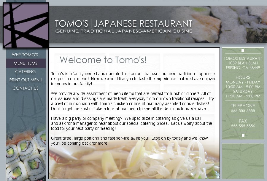
I tried to brighten the picture on the title, but it does distract. I will not know what goes here until I actually take pictures and choose something that I could bring out that doesn't go against the white font.
Fuck the color yellow. Asians are known as yellow people. I think we are done with the yellow. Haha.
Bryant - What do you mean by your comment? You mean you want blue on the right and left right? Well I'll do a mockup so you can see it, but I thought it was a little too plain. But again I'm the artist and I'm biased toward my opinion! Haha! So I'll post it soon so you can check it out.
Mar 31, 2006
Haha. I was gonna edit my original post so it looks like Andy pointed out all the things that I said not to worry about because he is an idiot. But I decided to give him some credit because he did say somethings that I had issues with also. Plus in my haste to get to sleep I decided to leave out all the things you shouldn't have to worry about in your critiques.
- Don't worry about the exclamation points. Hell...that isn't even what the welcome message is going to be. I was just filling it in to see the composition!!!!!!!!!!
- I haven't decided whether the main text in the middle window is going to be html based which is why it has such a hard edge to it. Perhaps inserting the text as graphics will help streamline the whole design?
- None of these pictures are of our food. I still need to go take the pictures that you see at every restaurant...you know like Carrows and their dessert items menu.
- That window on the bottom right I think will be to put up some messages like "buy gift certificates" or "buy a shirt" (which I don't even think we carry anymore haha) or "buy bottled our bottled sauce" blah blah blah.
- That isn't our logo either. I didn't feel like doing a good logo just yet because I am lazy.
Again the main thing I'm concerned about is the webpage itself. Perhaps it looks a little too modern or too should I say...sophisticated for the caliber of our restaurant. I mean our restaurant isn't a sit down and dine sort of place...well I guess it could be...I dunno. Keep the responses coming.
Okay so here is a quick design of the Tomo's website. My family gave me a menu and a bottle and said have at it. Unfortunately I don't get my own timeline so I can't take forever on this site. So I did this one in like two hours in photoshop from 4-6 am...so I'm tired and cranky. Lemme know any first impressions that you have. Complaints, compliments...anything is cool. ONLY SERIOUS CRITIQUES THOUGH so I can get this site rolling. Thanks!

Mar 30, 2006
I'm going to say this as simple as possible. This is about the custom chips and how Steve won't get off my nuts for ordering them...well here is the announcement...there are still certain things that must be met but here it is...
I am pretty sure that since I am a ChipTalk member that I can get these edge spot designs...these aren't the finalized ones but please take a look at what you can do. Color combos would be turned down at the time of order so pretty much anything right now is in the planning stages. Lemme see some mockups people! Fuck...I better get really cracking on these inlays before this offer goes away!
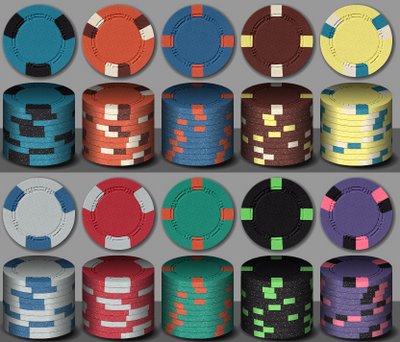
I am pretty sure that since I am a ChipTalk member that I can get these edge spot designs...these aren't the finalized ones but please take a look at what you can do. Color combos would be turned down at the time of order so pretty much anything right now is in the planning stages. Lemme see some mockups people! Fuck...I better get really cracking on these inlays before this offer goes away!

Subscribe to:
Posts (Atom)


